
A brand that tells a story

In the property sector, housing associations have an undeservedly poor reputation with the general public. These not for profit organizations do good work in the affordable housing sector and they deserve to have the full brand treatment. Working with Wates Residential in partnership with Rotherham Metropolitan Borough Council we created the brand Rother Living.
From a single element

In the beginning, we were given a single design element and requested that the brand be ‘bold and celebratory’. The design element was chosen as a reflection of the industrial heritage of the area.
It didn’t take long for the name Rother Living to be chosen as an homage to the local area. It just rolls off the tongue. The exclusion of ‘housing association’ from the name was to distance this fledgling brand from preconceived negative connotations that surround Housing Associations.
Creating a striking brand identity

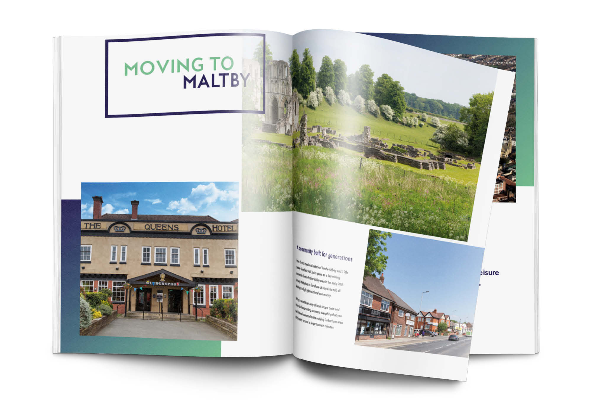
We focused on how the housing association is transforming locations and minds about Rotherham and its boroughs. This lends itself to the supporting notion/strap line ‘Transforming Rotherham.’ A complementary colour palette of purple and green adds vibrancy and a sense of dignity to the modern design element. It also creates a fantastic gradient that’s used throughout the first Rother Living housing brochure for Northgate. All together this creates a striking brand identity.
Measuring performance

Rother Living was designed to be welcoming and accessible to the public at large. Designed for the full suite of marketing channels, every detail was taken into consideration to ensure maximum impact.

Making sense of marketing
in the digital age
Third Floor, Towers Point
Towers Plaza
Wheelhouse Road
Rugeley, Staffordshire
WS15 1UN
Glen Mitton Limited. All Rights Reserved